Artist Interview 56: Yael Brotman
Toronto, Ontario, Canada
Kurotani paper is Yael’s chosen medium. Paper, in conjunction with pencil and paint is at the base of her practice. She creates both 2D and 3D pieces. Her work has basically pursued an ongoing investigation of the dichotomy between the mundane and the fanciful. She likes to play with composition and with new ideas, suggesting new conclusions because of their proximity to one another.
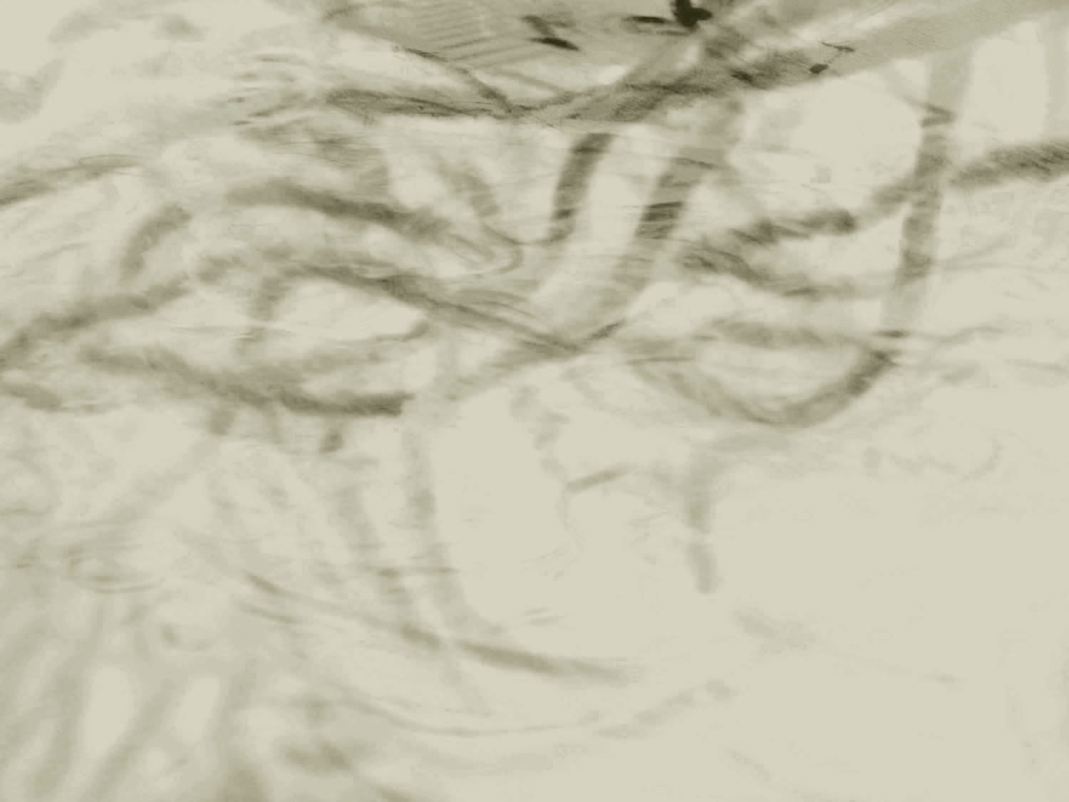
![Crank Up, 2011/12, Etching [sugar lift, drypoint] on Kurotani paper,
foamcore, mat board, 18" h x 12" w x 10" d](https://worldofthreadsfestival.com/wp-content/uploads/2023/02/01-top-crank-up-yael.jpg "01-top-crank-up-yael")

Tell us about your work?
For the past several years I have been working almost exclusively with Japanese paper, mostly Kurotani. I etch hand-drawn raw images on this paper and I then cut up and incorporate the paper into drawings, installations (pinned to the wall as well as hanging from the ceiling) and freestanding, three-dimensional paper sculptures. I've tried using other papers, like Chinese and other types of Japanese papers, but I've found that Kurotani which has short fibres, strength, translucency and a warm slightly golden colour works best for me.
My work has basically pursued an ongoing investigation of the dichotomy between the mundane (the utilitarian) and the fanciful (the fantastical or imaginative). Whether I am making drawings, prints, installations or sculptures, there is an allusion to the interplay between the two. I like to play with composition and with ideas, and with the dialectical opportunities for images that suggest new conclusions because of their proximity to one another.
In art school and beyond, I experimented with many different media, including handmade felt, indigo dyeing, handmade paper, basket making, weaving and ceramics. But the feel of paper keeps me enthralled, whether it is my favourite Japanese paper, printed handmade paper from Nepal or rolls of heavy drawing or printmaking paper. What a thrill it is to walk up and down the aisles of the Japanese Paper Place Warehouse or to open the paper drawers at Woolfitt's and surreptitiously touch the paper! Paper, in conjunction with pencil and paint, is at the base of my practice.

Previous World of Threads Exhibitions
Yael Brotman exhibited three sculptures in Festival 2012 Quiet Zone exhibition.

Fables, myths and folktales have been an ongoing fascination for me since childhood.
Where do you get your inspiration?
I have always had a great curiosity about social history and artifacts and how cultures have bridged the gap between the utilitarianism of objects and their design. I taught at the Royal Ontario Museum for a number of years, specializing in Ancient Civilizations. Because of my position there, I was able to have access to artifacts that the general public only saw rarely. My fascination with the migration of ideas from East to West and back again via the Silk Routes, was stoked by seeing the visible evidence of design elements that appeared at the same time in textiles, ceramics, prints, etc. in different parts of the world at such early historical dates. So the collections at the ROM were a huge inspiration for me (see ROM Cats).
Before I studied art at university, I completed an undergraduate degree in English Literature. Poetry and literature in general continue to inspire and create the scaffold for the concepts that underlie my work. Often my titles for bodies of work as well as individual pieces, are taken from books that I have been thinking about and which ideas I am building upon. For example, I borrowed a line from Rumi (13th century Persian poet), I Guess I Need More Grace Than I Thought, for the title of a print installation. That installation is about "Everyman", who is conflicted by what he sees within the nature of humankind: depths of depravity alongside great kindness and beauty.
Another poetry-inspired installation was Three Autumn Friends. It was taken from a Chinese poem titled Three Summer Friends. The work made of etched Kurotani paper, some of which had been stiffened by the use of matte medium, speaks of a poetic relationship between a harvest moon, a bird and a red flower (an electric LED construction). The opening of that exhibition took place during a full harvest moon (we had a sidewalk party with cider and cookies), so that the real moon was reflected in the window and became an echoing element in the composition.
Fables, myths and folktales have been an ongoing fascination for me since childhood. In a large work Dreamline, I was exploring questions about characters, objects, and ethics lessons present in traditional fables. Each image was drawn on paper that was then adhered to wooden blocks. This use of the wood block referenced the Japanese wood block printmaking tradition. In Japanese woodblock prints, the approach to storytelling as fragmentary and enigmatic is something I was playing with in my installation. I was also borrowing a love of detail in textile pattern from the Japanese. The offset grid of the installed lines of blocks referenced textile, in that it created a type of weave of blues on the wall.
Yet another source of inspiration for my work is the news. I try to go through the newspapers every morning. I clip out pictures that catch my eye. Several bodies of work emerged from news events and newspaper photos. Love in the Time of CNN, where images of the beginning of the war in Iraq were sourced, and the installation Golden Year (after Bowie) are a couple of examples. The latter was installed in a cloakroom at the back of a classroom at the Shaw St. Public School, Toronto. I gold-leafed the walls and hung a row of drawings between the cloakroom's double rows of coat hooks. The drawings were of children taken from the background of an original newspaper picture, such as children in a classroom sitting behind George Bush who was there for a photo op. In my drawings, I isolated and foregrounded the children. In the installation, to see the drawings the viewer had to bend down. The idea conveyed was that children's lives, with their difficult and sometimes brutal social negotiations, generally exist under the radar of most adults.

What other mediums do you work in, and how does this inform your work?e
Occasionally I paint. But I am more comfortable with, and excited by, using acrylic or watercolour as drawing media. When I do artist residencies, I take paint and brushes and small pieces of paper. Back in my own studio, I pin these sketches to the wall or place them on my worktable. They act as touchstones to whatever I am working on and sometimes they are even incorporated into my larger drawings.
I sometimes like to build things out of foam core. Years ago when I was making handmade paper, I began to build masks out of foam core and adhere the paper I made to the constructed shape. I seem to have come back to that lately – I've been building foam core cases for my three-dimensional paper houses and caravans in order to protect them in transit. In September I shipped two houses in these cases and they arrived safely in Melbourne, Australia, where I decided to exhibit them alongside the houses they had protected (a fitting reward to them for a job well-done). Because I liked the architectural nature of the foam core cases, I added gold leaf and used coloured tape to pack them up. Setting them up is so much fun: like playing with building blocks.


What bridges the works that you have created in differing media?
I often exhibit work in different media because that reflects my working process. For example, in my recent Loop exhibition I showed the constructed trailers and model-sized houses alongside the cases that protected them as well as the drawings.
The drawings (also with a collage aesthetic) were made throughout the construction of the 3D paper constructions. They acted as blueprints for the 3D pieces, as sketches of details of the finished pieces, and ultimately as enlarged versions of journals that a child in a trailer might keep to document a wilderness trip.


What specific historic artists have influenced your work?
There are a few historical artists whose works give me a real visceral response.
Velasquez: His painting Christ in the House of Mary and Martha is one that leaves me breathless. He captures volumes of subtle emotions in the expressions of the characters. He is such a master of chiaroscuro. Amazing technique. Plus I love the way he contemporizes historic or mythic stories.
Dutch Genre painting: The lusciousness of fruit, flowers, velvets, tapestries, pearls, gold. They are so seductive and gorgeous, even when man's vanity and 'Death will conquer all', are the themes.
Japanese woodblock print: Play with scale, detail of textile, armour, clothing and hairstyles; the drama of narrative.
Edward Hopper: His figures are sculptural in their mass. His work is very atmospheric within dark spaces, even when the sun is shining.
Larry Rivers: His process is visible – the solid structure underlying the figures and the looseness of the painting. [There is an odd ambivalence in the gentleness and empathy with which he portrayed his mother-in-law. He kept using her as a model when she was clearly uncomfortable posing in the nude.]
There may not be a direct and specific influence of these artists in my work. But it is their approach to their work and their processes that push me to experiment with both technique and attitude in my own work.


What specific contemporary artists have influenced your work?
David Hockney: I especially like the drawings and maquettes he did for opera productions. He is also impressive in that he has not stopped making art even though he's aging and his eyesight is going.
Sol Lewitt: His work is just plain brilliant. I learn something new every time I see a work of his.
William Kentridge: He has a traditional approach to figure drawing with charcoal, but is so inventive in animating his drawings. His shadow plays are pretty amazing too.
Judy Pfaff: I have followed her career for decades. She has great energy and works in installation, printmaking, sculpture and other media. All her works are very large scale. I love her use of materials in her installations.
Kiki Smith: She is also very multi-disciplinary in her practice. You can tell she loves the quality of the etched line on translucent paper, as I do. She seems fearless.
Luc Tuymans: He has an unconventional way of painting where he pins a large canvas to the wall and paints all over it. Then he cuts out the composition that he likes. The canvases are stretched after that into shapes and sizes that are dictated by the painted image, rather than the other way around.
Maira Kalman: The awkwardness of her paintings and illustrations are delightful and funny and yet she deals with some heart-wrenching story lines.
Anselm Kiefer: Powerful, expressionistic painterly movement but the political message is subtle and lyrical.
Herzog and de Meuron: Swiss architects whose ways of working inspire me.
There are also many local Toronto artists who are courageous and thoughtful. I feel very lucky to have such a strong committed community of artists who continue to work and exhibit. Some of these artists are: Libby Hague, Penelope Stewart, Rochelle Rubinstein, Lois Schklar, Lyn Carter, Jeannie Thib, Ed Pien, Howard Podeswa, Barbara Balfour, and Doug Guildford.


What other fibre artists are you interested in?
The Gee's Bend Quilters, El Anatsui, Lily Yung, Dorothy Caldwell, Kai Chan, and Susan Lindsay.

What is your philosophy about Fibre Art and what role do you think fibre art plays in contemporary art?
I see a marked divide between fibre artists and artists who use fibre. I think this reflects differences in the conceptual intents of the artists. The fibre artist seems bound by traditional use of technology and materiality, while the artist who uses fibre is bound by the veracity of her/his core concept. The latter approach interests me more. I have seen many exciting contemporary exhibitions at the Textile Museum in Toronto, which push boundaries of definition and self-identification.
I was just starting out when the battle was raging between art and craft and how disciplines are defined (late 1980s). It was a fascinating time because traditional hierarchies within the fine art community were also being shaken. Performance, video, sound art, installations and hybrids of all types were democratizing contemporary art. Fibre came to play a significant role in the work of important artists like Rebecca Belmore (who uses fibre and textile in her performance pieces,) Kiki Smith, and Cristo and Jeanne-Claude who used fabric to wrap islands, buildings and bridges.

When did you first discover your creative talents?
I remember the exact moment. I was six years old and had just emigrated from Israel to Winnipeg and spoke almost no English. It was summer and I was at a day camp. I was drawing a giant bride and my counselor made such a fuss over it, that it made me aware of drawing as something I could do. It has proven to be a lifelong means of exploring and communicating for me.

Please explain how you developed your own style.
After university and traveling extensively throughout Europe, I moved to Toronto. I took courses painting, weaving, design, printmaking, etc. at Three Schools and OCA. I wanted to learn everything. When I first began to exhibit, I showed handmade felt sculptures, felt and handmade paper masks, and drawings. I then discovered Open Studio where I explored all kinds of printmaking techniques. I gravitated to etching and silkscreen. There was great variety of techniques under the umbrella of these printing areas. I began by making small editions and then moved to varied editions, where I could play with the basic elements of the edition to create a different narrative in each. I began to incorporate drawing into prints and prints into drawings, as well as adding gold leaf and other unique insertions. And, Japanese paper became integral to my work in both my print/drawings and in my paper sculpture.
Looking back, perhaps my style came to be developed because of my love of the collage sensibility. My approach to printing mimicked the multi-layering build-up and inversions from my fibre origins.

What is different now is that I have more confidence in sticking with an idea and following through.
How does your early work differ from what you are doing now?
When I look at some of my early work, I can see similarities in approach to execution and in certain interests. What is different now is that I have more confidence in sticking with an idea and following through. When I was younger, I wanted to taste everything and know everything. I wasn't as good at pacing myself and many ideas were left incompletely expressed because I was on to examining another one. I was always self-disciplined, though now I can break down the jobs I need to do to complete a piece more easily. I make a plan of action for the day for myself every morning when heading out to my studio. It's amazing how satisfying it is at the end of the day to have accomplished those tasks.


Have you experienced fluctuations in your productivity through the years?
Yes, I have. Art and life are intimately interconnected. When my working life or my personal life has required more attention, my art making takes a back seat. My children's and my husband's wellbeing always came first. Somehow though I did squeeze in time to make art. Balancing my teaching with art making was also tricky. There were years when I taught way too much and thought that I was not so productive artistically. Today I have found a good balance: my children are independent and I teach two days a week at the University of Toronto Scarborough. With more dedicated time for studio work, I have become increasingly productive and am so happy about it. I am also able to be away from home for a month at a time or longer and have done several residencies outside of Canada.

What project has given you the most satisfaction and why?
The project that I work on at any given time is the one that I love the best because I am exploring new territory. The process of solving visual and technical problems is what satisfies me most. If the end of the day has come and the piece is not resolved, I go home, and right before I fall asleep, I visualize the problem area. The next day at the studio, the problem is somehow resolved. Sleep is really important when I'm on a roll in my work.

How did you initially start showing your work in galleries?
I was teaching art classes at the Koffler Centre of the Arts and thought that the space outside the studios could be used for exhibitions beyond student display. So I asked permission to exhibit there. Rochelle Rubinstein and I gave the space a name – the Loggia Gallery – sent out invitations and had a big opening for our friends. I exhibited handmade felt sculptures and wall pieces. I found that having a deadline of an upcoming exhibition really pushed me to produce more intensely. So I've always applied for or set up exhibitions as endpoints for a body of work. I seem to work very well under pressure.

Tell us about your studio and how you work:
When my children were very young, I tried to have my studio at home. It wasn't a successful experiment: I couldn't ignore the children or the dirty dishes. Even when I organized sitters, I still found it hard to create the psychological distance of a workplace within the personal space. Since that realization, I have always had a studio outside my home.
The locations of my studios are interesting in that they delineate the general migration of the art community in Toronto. I started on John St. north of Queen where a notable bike shop now occupies the main floor. Then I moved to Spadina Avenue, north of Adelaide above the Bank of Montreal. We were kicked out because of the boom of the dot.com companies of the 90s. After that, I moved on my own into a small attic space in Mirvish Village above the Victory Café. Now I am at Wallace St. west of Lansdowne and about to be replaced by a computer game design company. I have adored this studio because of the big windows and the morning light and the high ceilings.
How I work
The table in my studio is massive and takes up a quarter of the studio space. But it's on rollers that lock. I can work on all sides of the table. I have my cutting board, rulers, pencils, erasers, drawing paper at one end and a box of foam core scraps, piles of different etched images and matte medium and glue at the other end. I also have different source material, like sketches, photos, downloaded images, books and magazines on every other surface in the studio, like on my desk and my metal paper drawer. I like to keep everything visible, in case I want to incorporate a section of watercolour or an etched image on Japanese paper into a drawing.
I listen either to the jazz station or to CBC2 when I work, except when I need to solve a tough problem that requires complete concentration. Then I need absolute silence.
The etchings on Japanese paper that I use as raw material for my two- and three-dimensional pieces are not printed in my studio. I used to print everything myself at Open Studio but became sensitized to the acids, Varsol and oil-based inks. Even though the workspace at Open Studio is extremely well ventilated and clean, my health became compromised. Now I print at the studio of Master Printer Lorna Livey. Lorna and I have worked together for years.
These days in my studio I am alternating between constructing a paper house or caravan and creating a 2D drawing that elaborates on the concepts in surrealistic ways. When I am just beginning a new direction, I read a lot.

When working on an installation, how much do you improvise when you are on location?
You always have to be ready to accommodate the space. Be prepared to edit!

What interests you about the World of Threads festival?
The World of Threads festival provides an opportunity to be introduced to international artists working with fibre or referencing fibre in their work. It's also wonderful to have many galleries participating in a fibre-related theme. This gives it a sense of celebration.
